
Designing a small dining room sounds easy — until you actually do it. When space is limited, there’s nowhere to hide. Every decision matters more. Scale matters. Contrast matters. Texture and light really matter.
For this project, we were designing the dining area in our client’s new apartment. Before a single piece was ordered, our goal was simple: help her feel confident. Confident in the plan, confident in the selections, and confident that the room would feel just as good to live in as it looked on paper.
That’s where Mary’s Magic really starts — with clarity.
The Dining Room Before
The windowless room itself had good bones. Warm wood floors, neutral walls, and a recessed ceiling detail — all things we love. But it didn’t do anything, yet. It didn’t feel finished or intentional, and it didn’t reflect how our client wanted to live or entertain.
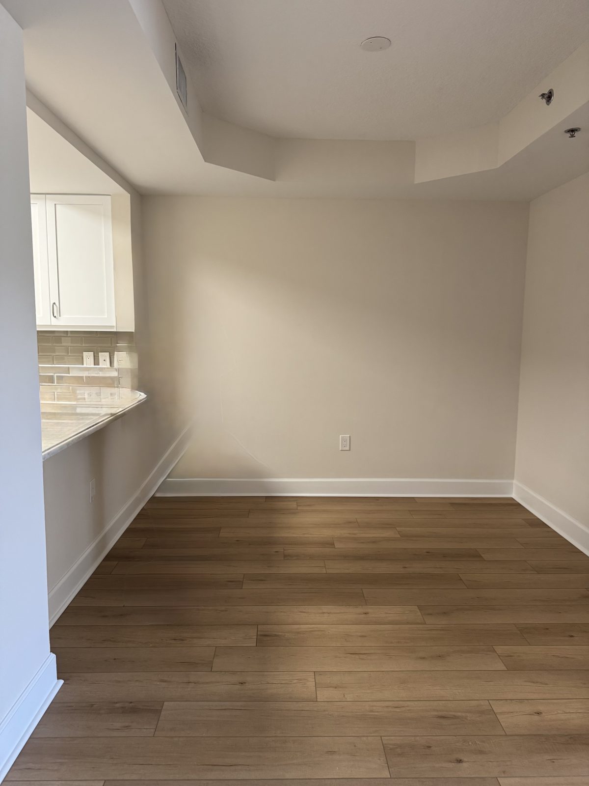
The dining area before design—neutral walls, warm wood floors, and a recessed ceiling detail, but no focal point.
We weren’t interested in filling the room just to fill it. Our focus was on adding depth and softness — giving the space a point of view without overwhelming it.
Seeing the Room Before It’s Real
Before committing to purchases, Mary drew a hand rendering to work through proportions, furniture placement, mirrors, and lighting. This step is central to our process. Once clients can see the space, decision fatigue disappears, and confidence takes its place.
“Every decision has to be intentional — scale, contrast, texture, and light matter even more when space is limited.”
— Mary Petron
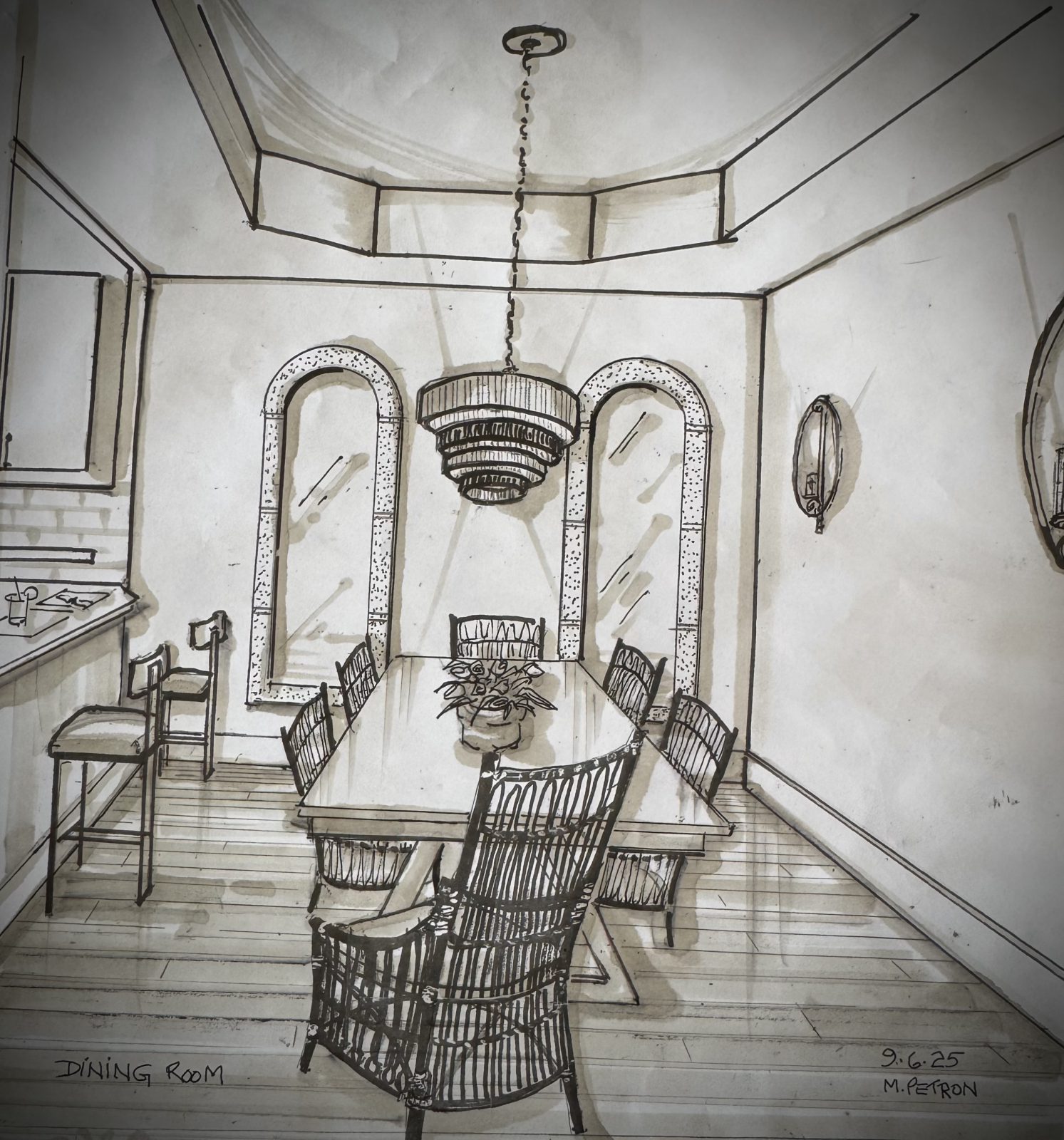
Mary’s hand rendering used to establish proportions, furniture placement, mirrors, and lighting before anything was ordered.
The rendering helped establish the direction early: curved elements to soften the room, layered lighting to warm it up, and contrast-driven seating to keep the space from feeling predictable. When the plan feels clear, everything else gets easier.
Mixing Instead of Matching
The dining table originally came with matching chairs. That would have worked — but it wouldn’t have been interesting. Instead, we paired the table with black rattan chairs. That single decision added instant depth and visual interest. The black grounds the space, the rattan keeps it relaxed, and together they make the room feel intentional rather than “set-y.”
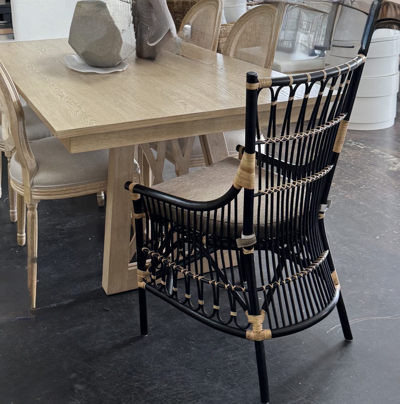
Black rattan dining chairs paired with a light wood table to introduce contrast and texture.
We also believe spaces should speak to each other. Rather than letting good pieces go unused, the table’s matching sideboard found a new life in the living room as a TV console, helping the design flow naturally throughout the apartment.
Mirrors, Light, and a Little Softness
To give the room more dimension, we selected two arched cane-and-bamboo mirrors. An arch in a small space softens everything — it adds movement, visual grace, and a sense of ease without trying too hard. The mirrors also helped add a source of reflected light in the windowless space.
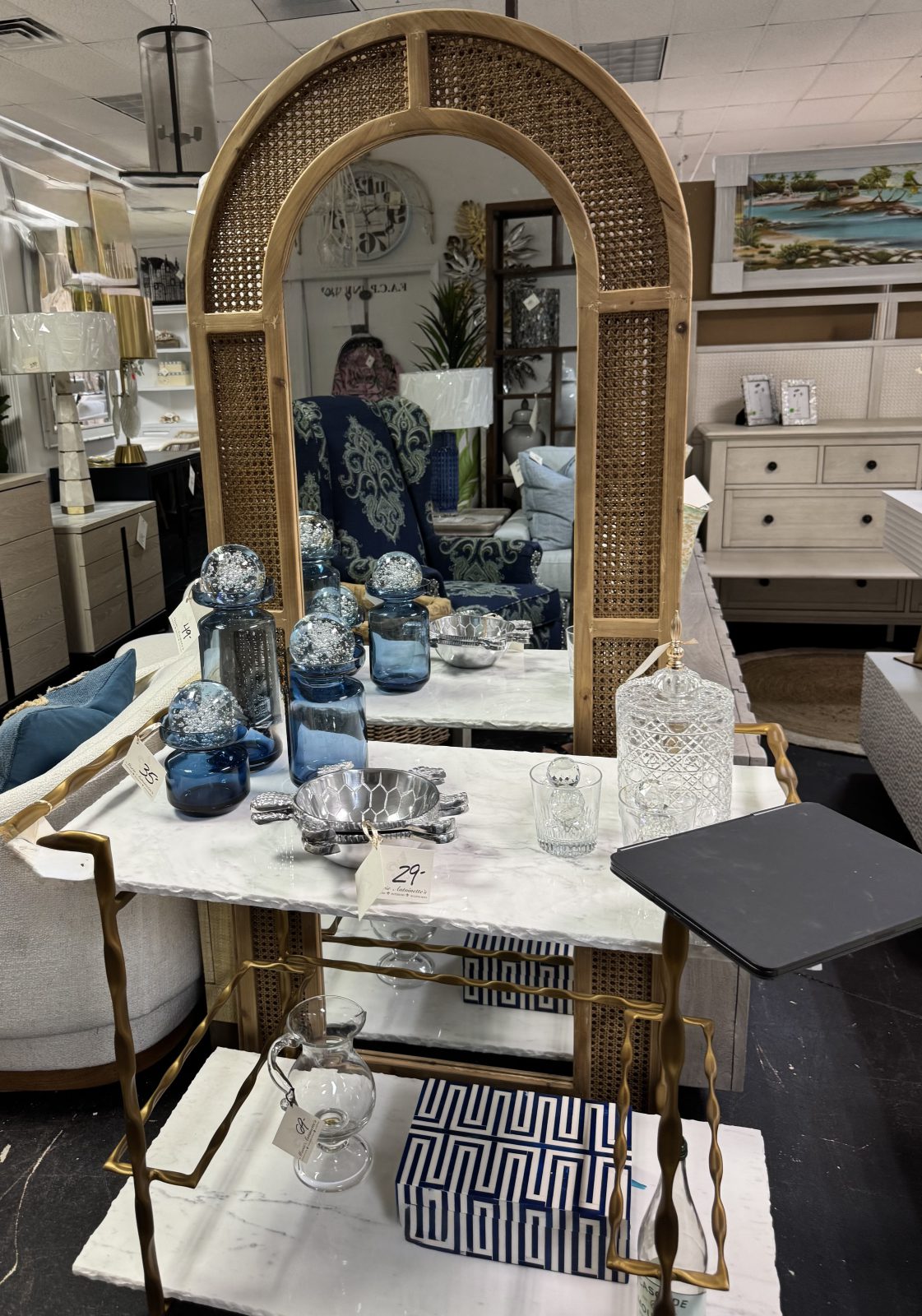
Arched cane-and-bamboo mirrors chosen for warmth, softness, and visual expansion.
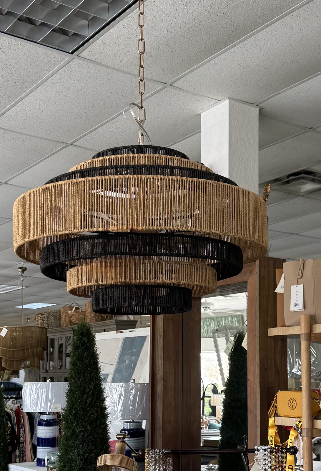
Layered wicker chandelier with black accents bringing warmth and texture overhead.
The wicker chandelier was chosen at the same time as the furniture. It’s one of those pieces that quietly does a lot of work: texture overhead, warmth throughout the room, and just enough black detailing to tie all the elements together.
Artwork That Carries Meaning
The walls in this room weren’t an afterthought — they were part of the story.
We added a black-and-white plate with a checked border above a black-and-white swan painting. Both pieces introduce gentle curves that echo the mirrors and soften the harder lines in the room. Their graphic quality balances the warmth of the wood and woven textures, keeping the space polished without feeling formal.
More importantly, these pieces connect back to artwork our client already loved — black-and-white images of women that graced the walls of her previous home. We weren’t trying to erase that history. We wanted it to evolve.
“Rather than replacing what my client loved, the goal was to let those familiar elements evolve into something new.”
— Mary Petron
That’s how a space feels personal without feeling stuck.
When the Lights Come On
One of our favorite moments in this dining room happens at night. When the chandelier is turned on, it throws streaks of light across the walls, interacting with the linear shadows created by the banding of the rattan chairs. It’s subtle, and you might not notice it right away — but it’s the kind of detail that makes a room feel alive.
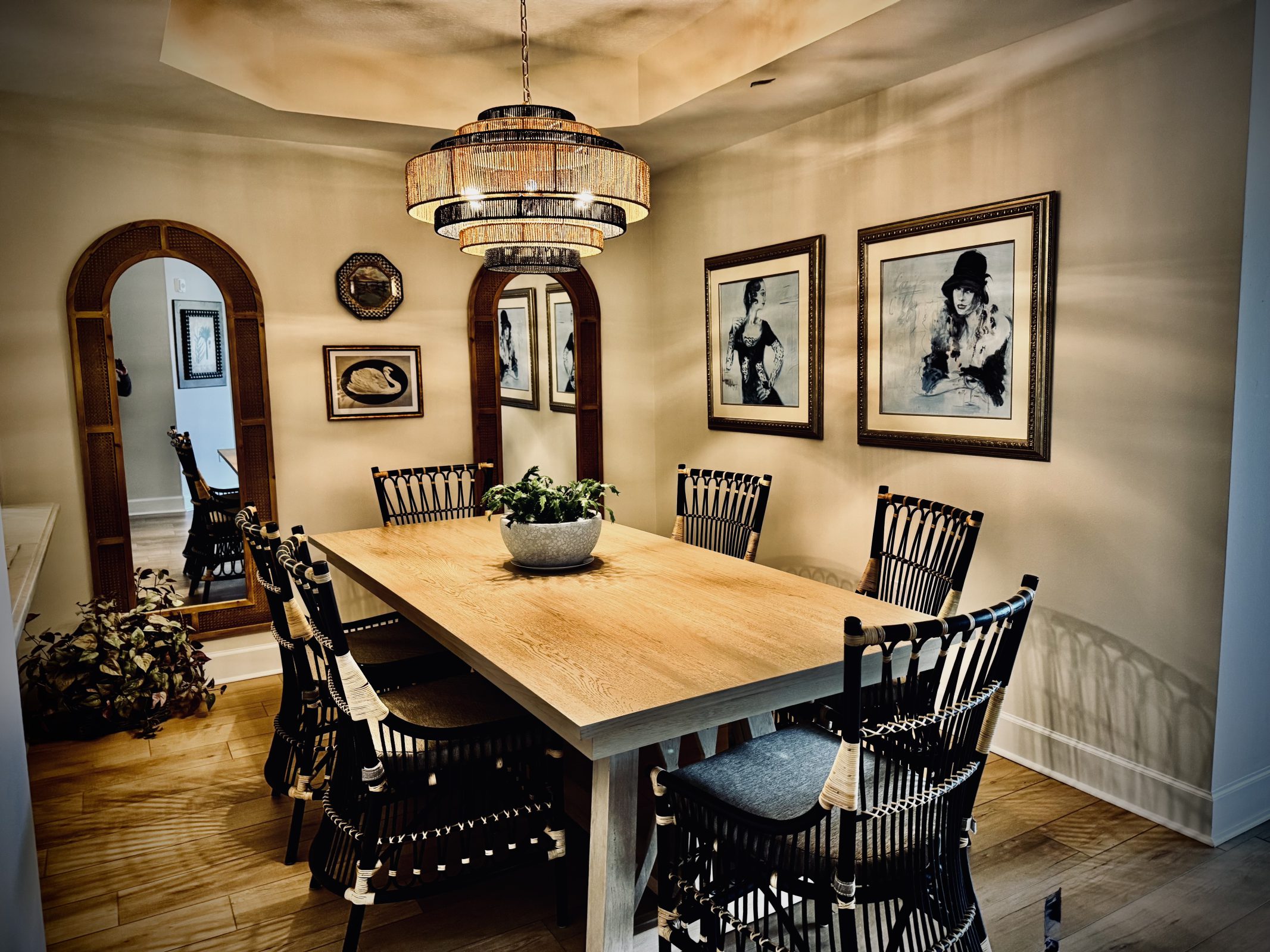
The finished dining room—layered, warm, and intentional, with contrast and texture bringing the space to life.
The Finished Room
The completed dining room feels layered, warm, and intentional. Nothing is shouting. Nothing is trying too hard. Every element relates to another — through shape, material, or tone — and the room simply works.
What we love most is how closely the finished space mirrors the original rendering. The vision didn’t change. It just came to life.
Final Thoughts
This dining room didn’t need more furniture or bolder pieces. It needed contrast, texture, and intention — thoughtfully layered so the space feels easy to live in, not precious. Perhaps, even more important was making the room look “stylish,” just like our client.
That’s the heart of Mary’s Magic: design that feels elevated, personal, and effortless — luxury you actually get to live with.